For report in pdf pdf_link
For notebook notebook
The aim of this project is to perform an in-depth analysis
assosiated with the assumptions of Modern Portfolio Theory
and how financial assets interact within the portfolio using sttistical
methods
Harry Markowitz introduced the mean-varinace
portfolio selection theory in 1952.Since then the Modern Porfolio theory
is cornerstone in the field of modern finance
import numpy as np
import pandas as pd
import matplotlib.pyplot as plt
import seaborn as sns
import requests
sns.reset_defaults()Twelve stock quoted on NYSE are used for the purpose of analysis.
The data is between the period of 1st January 2008 to 31st December
2017. The data is downloaded using Twelvedata API in the
json format. The stocks are divident adjusted
| Company | Symbol |
|---|---|
| Apple Inc | AAPL |
| American Express Co | AXP |
| Boeing Co | BA |
| General Electric | GE |
| Johnson & Johnson | JNJ |
| JPMorgan Chase & Co | JPM |
| Coca-Cola Co | KO |
| McDonald’s Corp | MCD |
| Microsoft Corp | MSFT |
| Verizon Communications Inc | VZ |
| Walmart Inc | WMT |
| Exxon Mobil Corp | XOM |
# dowloading data using twelve data api
tickers = ["AAPL", "AXP", "BA", "GE","JNJ", "JPM", "KO", "MCD", "MSFT", "VZ",  "WMT", "XOM"]
api_key = "*************************************"
interval = "1day"
start = "2008-01-01"
end = "2018-01-01"
stocks = []
def stock_data(tick):
    url = f'https://api.twelvedata.com/time_series?symbol={tick}&start_date={start}&
                end_date={end}&interval={interval}&order=ASC&apikey={api_key}'
    data = requests.get(url).json()
    return data["values"]
df = pd.DataFrame()
df["datetime"] = pd.DataFrame(stock_data("AAPL"))["datetime"]
for tick in tickers[:6]:
df[tick] = pd.DataFrame(stock_data(tick))["close"]for tick in tickers[6:]:
df[tick] = pd.DataFrame(stock_data(tick))["close"]# datetime as index
df["datetime"] = pd.to_datetime(df["datetime"])
df.index = df["datetime"]
df.drop(["datetime"], axis=1, inplace=True)df.head()| datetime | AAPL | AXP | BA | GE | JNJ | JPM | KO | MCD | MSFT | VZ | WMT | XOM |
|---|---|---|---|---|---|---|---|---|---|---|---|---|
| 2008-01-02 00:00:00 | 6.95857 | 51.04 | 86.62 | 282.769 | 65.91 | 42.17 | 30.545 | 58.1 | 35.22 | 40.3385 | 46.9 | 93.51 |
| 2008-01-03 00:00:00 | 6.96179 | 50.41 | 86.98 | 283.077 | 65.93 | 41.88 | 30.865 | 57.93 | 35.37 | 40.5253 | 46.38 | 93.83 |
| 2008-01-04 00:00:00 | 6.43036 | 49.14 | 85.82 | 277.231 | 65.84 | 40.93 | 30.925 | 57.05 | 34.38 | 39.7691 | 45.72 | 92.08 |
| 2008-01-07 00:00:00 | 6.34429 | 49.36 | 82.87 | 278.308 | 66.86 | 41.34 | 31.655 | 58.03 | 34.61 | 40.4692 | 46.56 | 91.22 |
| 2008-01-08 00:00:00 | 6.11607 | 47.95 | 79.91 | 272.308 | 66.94 | 39.7 | 31.785 | 57.08 | 33.45 | 39.1996 | 45.97 | 90.05 |
# any na values
df.info()
<class 'pandas.core.frame.DataFrame'>
DatetimeIndex: 2518 entries, 2008-01-02 to 2017-12-29
Data columns (total 12 columns):
# Column Non-Null Count Dtype
--- ------ -------------- -----
0 AAPL 2518 non-null object
1 AXP 2518 non-null object
2 BA 2518 non-null object
3 GE 2518 non-null object
4 JNJ 2518 non-null object
5 JPM 2518 non-null object
6 KO 2518 non-null object
7 MCD 2518 non-null object
8 MSFT 2518 non-null object
9 VZ 2518 non-null object
10 WMT 2518 non-null object
11 XOM 2518 non-null object
dtypes: object(12)
memory usage: 255.7+ KBdf.isna().sum()AAPL 0
AXP 0
BA 0
GE 0
JNJ 0
JPM 0
KO 0
MCD 0
MSFT 0
VZ 0
WMT 0
XOM 0
dtype: int64df = df.astype("float")We calculate the daily change in prices of stock using the given formulae
$$r_{asset} = \frac{P_t - P_{t-1}}{P_{t-1}}\times100$$
where
Pt is present value of adjusted close price of individual stock
Pt − 1 is previous day adjusted close price of individual stock
rasset daily return on assest
df = df.pct_change().dropna()
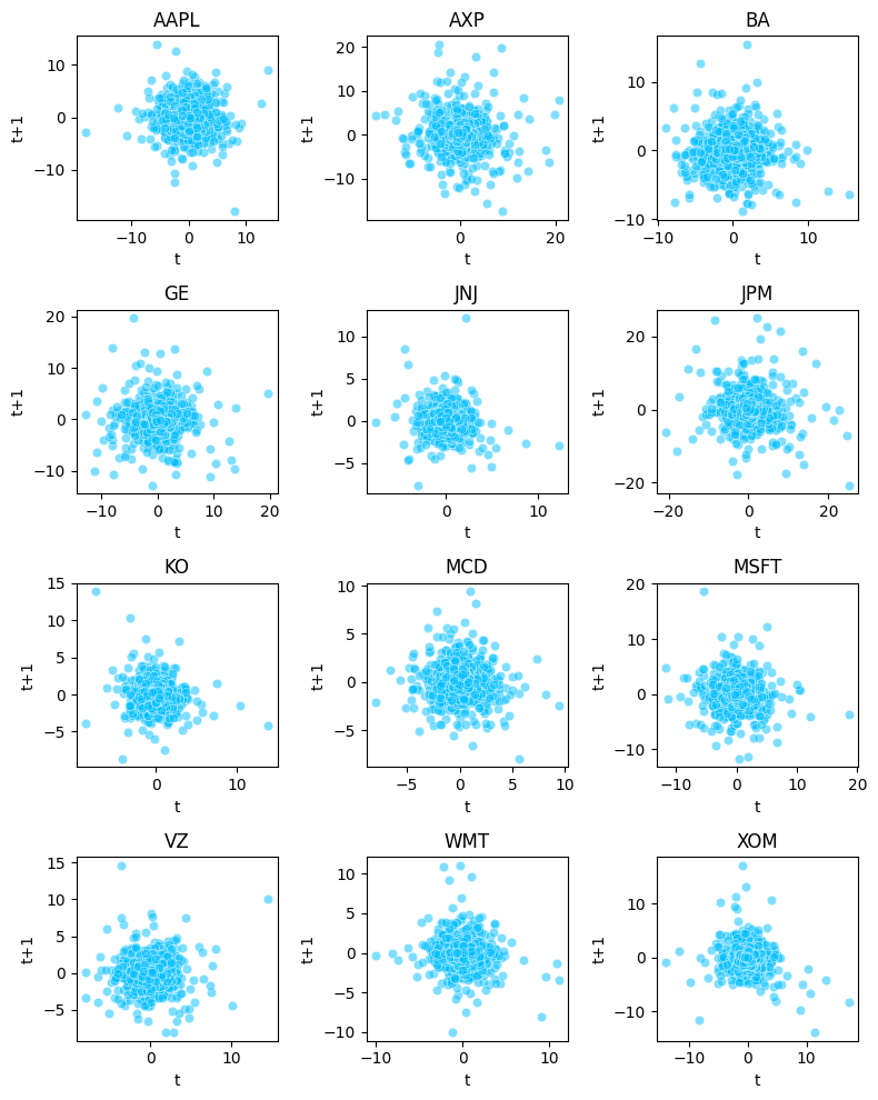
df = df*100According to Random Walk Theory stock price change
are independent of past movement trends and therefore next day price
cannot be predicted from previous price changes
We plot a simple scatterplot for our twelve assets
where we compare the previous day return against the present value and
it shows absolutely no correlation for any of the assets
which proves the assmption to be true
fig, axes = plt.subplots(nrows=4, ncols=3, figsize=(8,10))
tickers = df.columns
x = 0
for i in range(4):
    for j in range(3):
        ax = sns.scatterplot(x=df[tickers[x]], y=df[tickers[x]].shift(1),color="deepskyblue",alpha=0.5, ax=axes[i,j])
        ax.set_title(tickers[x])
        ax.set_xlabel("t")
        ax.set_ylabel("t+1")
        x = x + 1
plt.tight_layout()
The daily return on assets are collected and represented in the
form of histogram given in the figure below, from initial
analysis it seems that most of the stocks closely resemble
normal distribution. Most of these returns are
concentrated towards the mean value but a
small portion of these return are scattered at the end of the
distribution showing few days where there is large swing in
price
fig, axes = plt.subplots(nrows=4, ncols=3, figsize=(8,8))
tickers = df.columns
x = 0
for i in range(4):
    for j in range(3):
        ax = sns.histplot(df[tickers[x]], bins=25, color="navy", alpha=0.7, ax=axes[i,j])
        ax.set_title(tickers[x])
        x = x + 1
plt.tight_layout()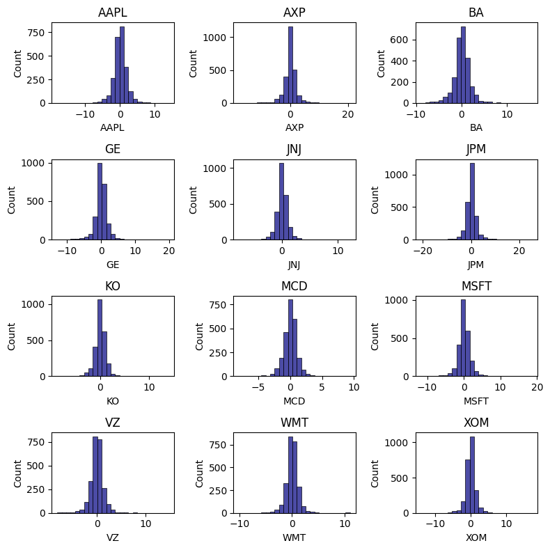
from scipy import stats
tickers = df.columns
xnor = np.arange(-10,10, 0.1)
ynor = stats.norm.pdf(xnor)
x = 0
fig, axes = plt.subplots(nrows=4, ncols=3, figsize=(10,8))
for i in range(4):
    for j in range(3):
        ax = sns.kdeplot(df[tickers[x]],color="violet", fill=True, ax=axes[i,j])
        sns.lineplot(x=xnor, y=ynor, lw=1.5, color="navy", ax=axes[i,j], label="Normal")
        ax.set_xlim(-4,4)
        ax.set_title(tickers[x])
        ax.set_xlabel("")
        x = x + 1
plt.tight_layout()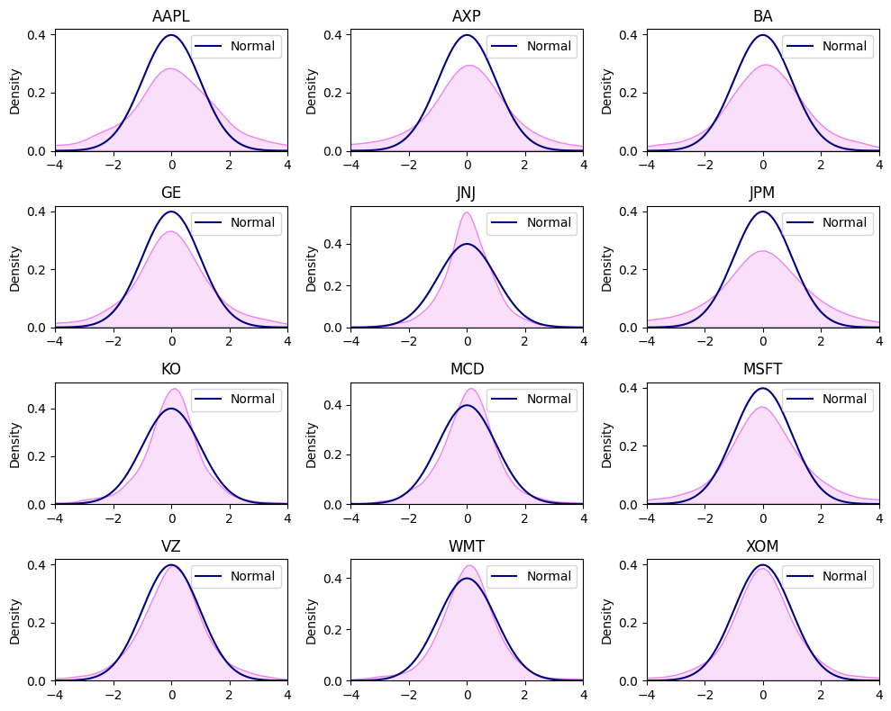
pd.DataFrame(df.mean(), columns=["MeanReturn"]).T| AAPL | AXP | BA | GE | JNJ | JPM | KO | MCD | MSFT | VZ | WMT | XOM | |
|---|---|---|---|---|---|---|---|---|---|---|---|---|
| MeanReturn | 0.0910855 | 0.0565557 | 0.0651659 | -0.00971978 | 0.0352106 | 0.0744775 | 0.0229866 | 0.0500293 | 0.0505538 | 0.0202781 | 0.0371706 | 0.00742542 |
plt.figure(figsize=(7,3))
ax1 = sns.barplot(x=df.columns, y=df.mean(), color="violet")
ax1.set_title("Mean Returns b/w 2008-17");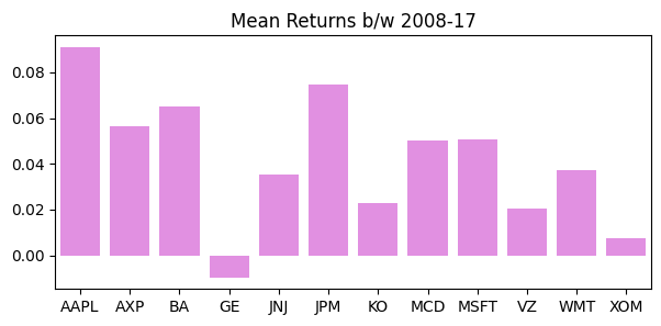
In the context of finance the risk can be defined as the
uncertainty in the market. Mathematically it can defined as
the deviation away from the expected
historical returns during a particular time period. A more
preferred definition in our context of our analysis is the
degree of making loss on a potential investment.There are
several statistical methods use to measure financial risk
Standard Deviation is the most commonly employed method for calculating financial risk. It can be expressed as.
$$sd_{asset} = \sqrt{\frac{\sum_(x_i - \mu)^2}{N}}$$
N is the total number of daily returns observed,
xi is daily observed return,
μ is mean return observed during N days.
The greater the Standard Deviation of the security
the more risky the asset is (in relative terms). The
Standard Deviation calculates the historical volatility of
the security, greater the dispersion from the
mean value indicates more volatile asset. From
the table we can observe that JNJ is least risky asset with standard
deviation of 1.0321% while JPM is the most risky asset with standard
deviation of 2.733%.
pd.DataFrame(df.std(), columns=["SD"]).T| AAPL | AXP | BA | GE | JNJ | JPM | KO | MCD | MSFT | VZ | WMT | XOM | |
|---|---|---|---|---|---|---|---|---|---|---|---|---|
| SD | 1.96343 | 2.46044 | 1.81769 | 1.99671 | 1.03731 | 2.75639 | 1.17105 | 1.17366 | 1.75271 | 1.38044 | 1.23344 | 1.54305 |
plt.figure(figsize=(7,3))
ax1 = sns.barplot(x=df.columns, y=df.std(), color="navy", alpha=0.7)
ax1.set_title("Mean Returns b/w 2008-17");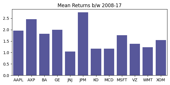
A more preferable method is using the
daily volatility clustering technique which helps in
visualizing the volatility at specific periods
in time.From Figure we can observe that the period between the year
2008 to 2010 was extremely volatile period due to rapid
change in the stock prices from their mean value, the contributing
factor for this rapid movement was in response to the
subprime mortgage crises in US due to which their was a
large scale financial panic in the market. After the
US government intervened in the financial markets to calm
down the rapid volatility in the market, the price movement
started to become less intense.
fig, axes = plt.subplots(nrows=4, ncols=3, figsize=(10,8))
tickers = df.columns
x = 0
for i in range(4):
    for j in range(3):
        ax = sns.lineplot(x=df.index, y=df[tickers[x]],color="royalblue",alpha=1, ax=axes[i,j])
        ax.tick_params(labelrotation=45)
        ax.set_title(tickers[x])
        ax.set_xlabel("")
        ax.set_ylabel("SD")
        x = x + 1
plt.tight_layout()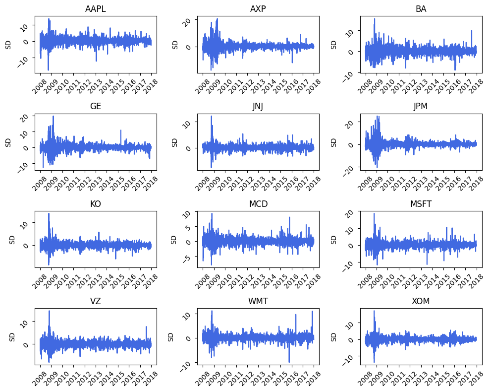
Markowitz (1952) argued that the individual risk
pertaining to an asset is not as much important as the
contribution of risk from each asset to the
aggregate portfolio.In the financial markets only those
risk are compensated that cannot
be avoided.
In the financial market no two financial assets are either
completely correlated or completely independent of each other, to some
degree each asset is interrelated to the
movement of the prices of another asset , some assets have
very high degree of co-movement while some have less exposure to each
other. The Modern Portfolio Theory attempts to analyze the
interrelationship between different investments. It
utilizes statistical measures such as correlation to
quantify the diversification effect on portfolio
The extent to which the risk of the portfolio can be reduced
largely depends on the covariance between different assets.
Portfolio assets which have low correlation coefficients
are considered to be less risky than pairs with high
coefficients
Within the portfolio ofN assets there are N
variances and N(N-1) covariance. As the number of assets in
the portfolio increases the number of covariance increases
rapidly. This large number of covariance are very
importanttowards determining the risk of the
portfolio.
In the Figure we can observe that at the start of the year
2008 the correlation among the assets were
lowas the crises took of , the correlation
start to become stronger between the various
pairs of asset. In the year between 2009 and
2013 we can see a high correlation among the assets which
can be attributed to the increase in
systematic risk due to panic in the US
financial industry. After 2013 the correlation among the pairs of asset
start to decline due to decrease in systematic risk. During
the time of financial stress the correlation among the pairs of the
portfolio becomes very high due to intense
volatility in the market.
fig, axes = plt.subplots(nrows=3, ncols=3, figsize=(8,8))
periods =["2008-12-31", "2009-12-31","2010-12-31","2011-12-31","2012-12-31","2013-12-31","2014-12-31","2015-12-31","2016-12-31"]
x = 0
for i in range(3):
    for j in range(3):
        ax = sns.heatmap((df[:periods[x]].corr()), lw=0.5, cmap="YlGnBu", cbar=False, ax=axes[i,j])
        ax.set_title(periods[x][:4])
        x = x + 1
plt.tight_layout()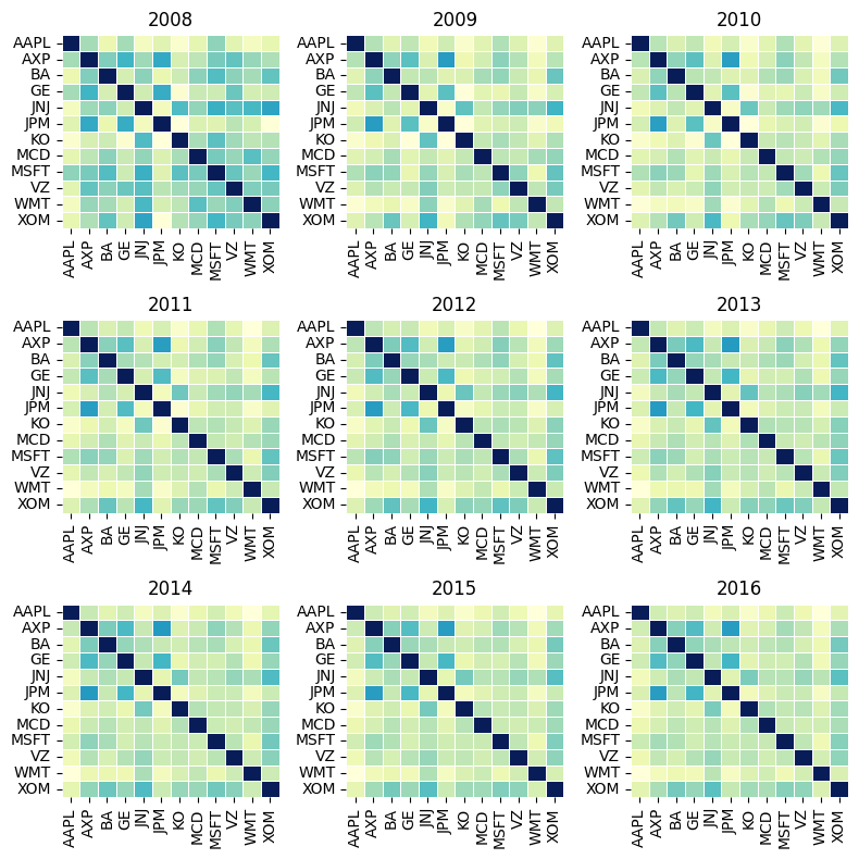
Sharpe ratio give insight to the investor what he is getting as a return on a security for the unit amount of risk he is taking. Sharpe ratio is calculated using
$${Sharpe Ratio} = \frac{R_{asset}-R_f}{\sigma_{assest}}$$
Rasset return on asset
Rf risk free rate
σasset SD of asset
Modern Portfolio theory sttes that adding assets to a portfolio
that have low correlation can decrease
portfolio risk without sacrificing the return. The
larger the sharpe ratio the
better it is for portfolio
pd.DataFrame(df.mean()/df.std(), columns=["Sharpe Ratio"]).T| AAPL | AXP | BA | GE | JNJ | JPM | KO | MCD | MSFT | VZ | WMT | XOM | |
|---|---|---|---|---|---|---|---|---|---|---|---|---|
| Sharpe Ratio | 0.0463911 | 0.022986 | 0.035851 | -0.00486789 | 0.0339443 | 0.02702 | 0.019629 | 0.0426267 | 0.0288432 | 0.0146896 | 0.0301357 | 0.00481216 |
plt.figure(figsize=(7,3))
ax1 = sns.barplot(x=df.columns, y=df.mean()/df.std(), color="violet", alpha=0.7)
ax1.set_title("Mean Returns b/w 2008-17");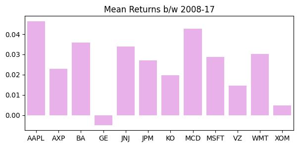
The effect of diversification is of central importance to Modern
Portfolio Theory. The process of diversification suggests the investor
to invest in multiple assets across different
asset classes and industries. As the number of securities in the
portfolio increases the portfolio become less
risk inherent.
But the decreases is non linear in
nature. As in the Figure we can observe that as the number of assets
increase (equal weighted portfolio) the standard deviation decreases at
a diminishing rate, after adding a certain number of assets
if we add more assets to the portfolio it does not have
much impact in decreasing the portfolio risk because some
risk will always remain in the form of systematic risk which cannot be
reduced.
dec_sd = df.std().sort_values(ascending=False).index
wport_sd =[]
for i in range(1,13):
    equal_weight = np.repeat(1/i, i).reshape(-1,1)
    covar = df.loc[:,dec_sd[:i]].cov().to_numpy()
    sd = np.sqrt(np.dot(equal_weight.T,np.dot(covar, equal_weight)))
    wport_sd.append(sd)
wport_sd = np.array(wport_sd).reshape(12,)
plt.figure(figsize=(8,4))
sns.scatterplot(x=range(1,13), y=wport_sd, color="red", s=50, legend=False)
sns.lineplot(x=range(1,13), y=wport_sd, color="black", legend=False);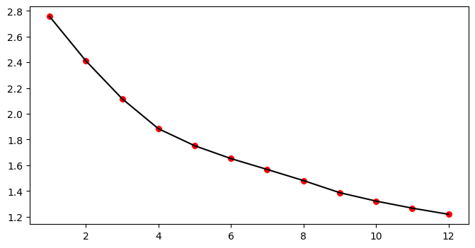
From Volatility clustering we can conclude that portfolio returns are much less volatile than any single stock return
dates = df.index
freq_assets = df.shape[1]
daily_returns = []
weight = np.repeat(1/freq_assets, freq_assets).reshape(-1,1)
for date in dates:
    asset_return = df.loc[date].to_numpy()
    port_return = np.dot(weight.T, asset_return)
    daily_returns.append(port_return)
portfolio_return = np.array(daily_returns).reshape(df.shape[0],)fig, axes = plt.subplots(nrows=4, ncols=3, figsize=(10, 10),dpi=120)
tickers = df.columns
x = 0
for i in range(4):
for j in range(3):
ax = sns.lineplot(x=df.index, y=df[tickers[x]],color="deepskyblue",alpha=1, ax=axes[i,j])
sns.lineplot(x=df.index, y=portfolio_return, color="black",linewidth=0.5, alpha=0.8, ax=axes[i,j], label="Portfolio")
ax.tick_params(labelrotation=45)
ax.set_title(tickers[x])
ax.set_xlabel("")
ax.set_ylabel("SD")
x = x + 1
plt.tight_layout()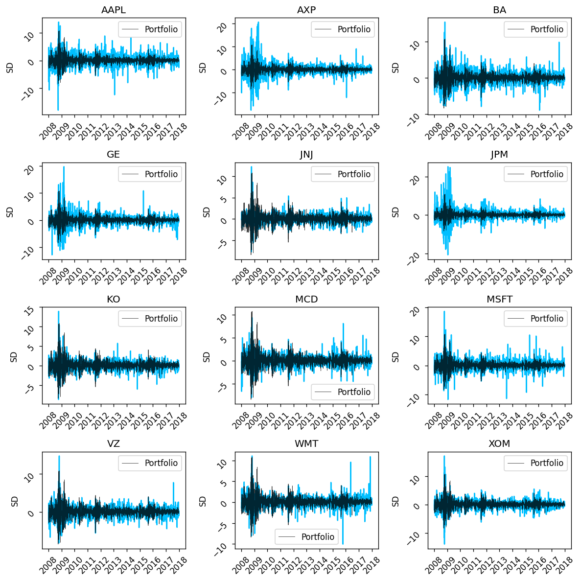
Markowitz concluded that out of infinite portfolio
that can be constructed by assigning different weights to
the portfolio (of the 12 stocks) there will be one
efficient portfolio which gives an investor
maximum return for a given amount of risk.
The investor would always prefer the portfolio over the
other inefficient portfolios because it maximizes his
utility
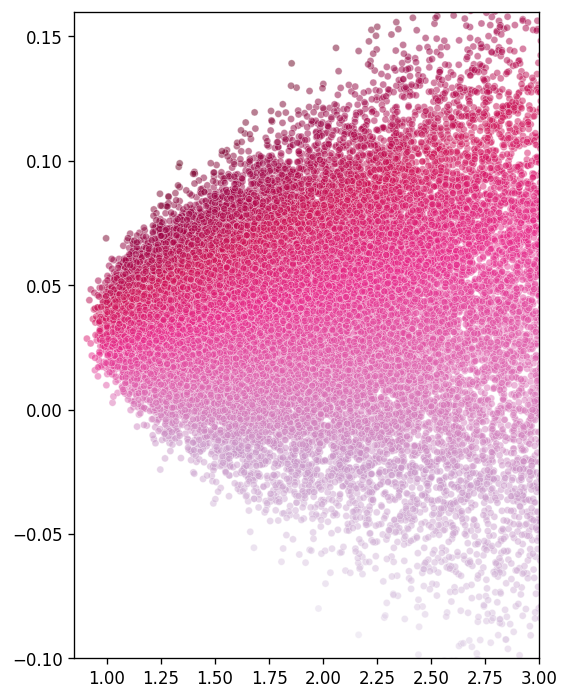
Using computer simulation we have generated more
than 50,000 randomly weighted portfolios out of the 12 stocks and
plotted their expected return and standard deviation.
From the Figure we can observe that these random portfolios
constitutes a parabolic curve. At the edge of
these curve lie the efficient portfolios which investor
prefer over other portfolios based on their
utility.
row = 50000
col = 12
random = np.random.normal(size=row*col).reshape(row,col)
sum_ = random.sum(axis=1)
weights = []
for idx in range(row):
    weight = random[idx]/sum_[idx]
    weights.append(weight)
weights = np.array(weights)
mean = []
sd = []
covar = np.array(df.cov())
daily_mean = np.array(df.mean())
for idx in range(weights.shape[0]):
w = weights[idx].reshape(-1,1)
port_mean = np.dot(w.T,daily_mean)
port_sd = np.sqrt(np.dot(w.T, np.dot(covar,w)))
mean.append(port_mean)
sd.append(port_sd)
mean = np.array(mean).reshape(row,)
sd = np.array(sd).reshape(row,)
sharpe = mean/sdplt.figure(figsize=(5,7),dpi=120)
ax = sns.scatterplot(x=sd, y=mean, color="red", size= 2,alpha=0.5, hue=sharpe, palette="PuRd", legend=False)
ax.set_xlim(0.85,3)
ax.set_ylim(-0.1,0.16);